Australian SME websites face a formatting decision that looks trivial until you measure its effect on engagement: how long should a paragraph be on a mobile screen? The research literature offers at least three different numbers. Designary’s UX guidelines recommend 30–50 characters per line on mobile. LawRank says two to three sentences per paragraph. And Baymard Institute’s usability testing confirms that line length substantially impacts readability on ecommerce sites, though the exact sweet spot varies by context.
All of which raises an awkward question. If the experts disagree on specifics, how should a plumber in Melbourne or a physiotherapist in Brisbane actually format their service pages?
There are three credible approaches. You can follow the short-paragraph orthodoxy, you can trust responsive design to handle readability through CSS, or you can A/B test paragraph variants against your own traffic. Each comes with distinct tradeoffs in effort, cost, and reliability. Let’s weigh them honestly.
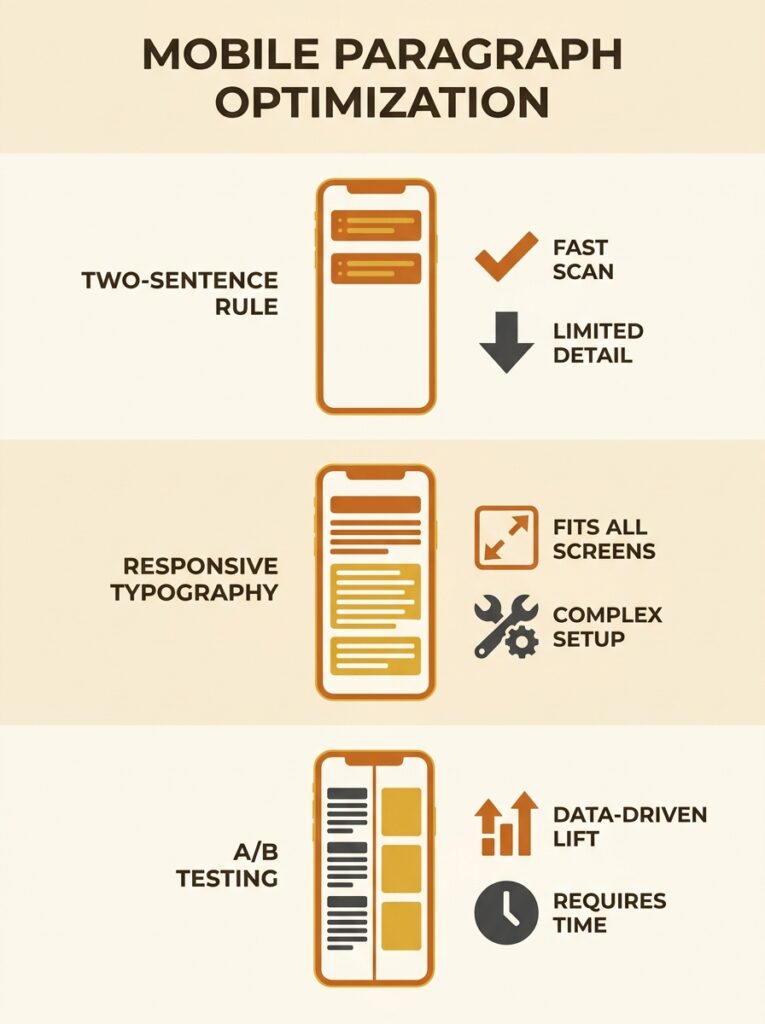
The Two-Sentence Rule
The simplest mobile content formatting best practice you’ll encounter is the ultra-short paragraph. Keep every block of text to two or three sentences, never more. LawRank’s mobile optimisation guide calls this the ideal target, adding that short shouldn’t mean boring or uninformative.
The logic is sound. On a 375-pixel screen, a five-sentence paragraph becomes a dense wall of text that fills the entire viewport. Users have to scroll past it without any visual breathing room. Two or three sentences break the text into scannable chunks, and scannable content gets read more often than dense content.
Where it works well
Service pages, product descriptions, and FAQ sections benefit from this approach. If a potential customer is comparing three electricians in Sydney and one of them has tight, readable paragraphs while the others dump information in long blocks, the readable one earns more time on page. For businesses investing in content strategy and production, keeping mobile readability front of mind during the writing phase is far cheaper than reformatting after publication.
Where it falls apart
Blog posts, case studies, and any page that requires building an argument across multiple connected ideas suffer when you chop every paragraph to two sentences. The result reads choppy, almost breathless. You lose the ability to develop a point before moving to the next one. And if your competitors’ content reads like it was written by an adult while yours reads like a bulleted list in disguise, that’s a credibility gap.
The two-sentence rule is a safe default for transactional pages. But applying it site-wide, without testing, means you’re optimising for one metric (scannability) while potentially hurting another (perceived authority).

Responsive Typography Does the Heavy Lifting (In Theory)
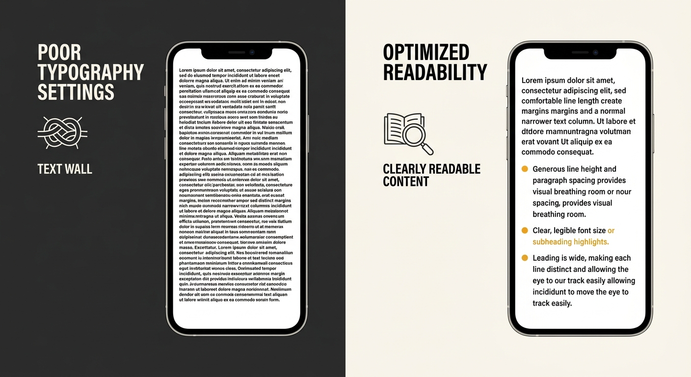
A second school of thought argues the paragraph length debate misses the point. What matters is line length, not paragraph length. If your CSS delivers 30–50 characters per line on mobile devices, even a six-sentence paragraph remains readable because the eye can track each line without getting lost.
This idea draws from solid typographic research. UX Stack Exchange discussions point to 40–50 characters as a realistic mobile target, while desktop recommendations sit at 50–75 characters. The argument is that if you get the container width, font size, and line height right, the reader’s experience improves regardless of how many sentences you pack into a paragraph.
Where it works well
This approach is attractive for businesses that already have substantial content libraries. Instead of rewriting hundreds of pages, you adjust your theme’s typography settings. Body text at 16–18px, line height at 1.5–1.6, and container widths constrained to roughly 35–45 characters on small screens will improve readability across the board. It’s a design fix rather than a content fix, which makes it faster and cheaper to implement.
If your site already follows mobile-first web design principles, you may find that a typographic audit catches most of the readability problems without requiring a single word to be rewritten.
Where it falls apart
Typography fixes don’t address cognitive load. A properly typeset seven-sentence paragraph with perfect line length still asks the reader to hold more ideas in working memory than a three-sentence paragraph does. And on mobile, where attention is fragmented by notifications and context-switching, cognitive load matters more than it does on desktop.
There’s also a practical problem: many Australian SMEs use page builders like Elementor, Divi, or Squarespace templates where fine-grained typographic control is limited. You can change font sizes, sure. But achieving precise character-per-line counts across every device width often requires custom CSS that the business owner doesn’t know how to write and shouldn’t be expected to maintain.
A/B Testing Paragraph Variants Against Real Traffic
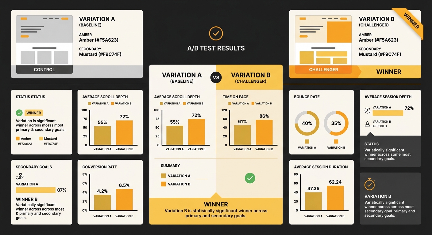
The third option treats paragraph length as a testable variable rather than a stylistic preference. Instead of picking a rule and hoping it applies to your audience, you create two versions of the same page with different paragraph structures and measure which one performs better on the metrics that matter to your business.
For paragraph length SEO testing, the setup is straightforward. Take a high-traffic page, duplicate it, and reformat the duplicate so that paragraphs are consistently shorter (or longer) than the original. Use Google Optimize’s successor (third-party tools like VWO, Convert, or even a simple server-side redirect split) to send half your traffic to each version. Measure time on page, scroll depth, conversion rate, and bounce rate over two to four weeks.
Where it works well
A/B testing on-page elements like paragraph length is the only approach that accounts for your specific audience. A landscaping company in Perth whose visitors are browsing from job sites during lunch breaks will have different reading patterns than a financial adviser in Melbourne whose visitors are researching from home. No universal rule covers both scenarios.
Testing also produces compounding returns. Once you know your audience reads best at three sentences per paragraph (or five, or some mix depending on content type), that insight shapes every page you publish going forward. When you’re diagnosing why rankings aren’t converting to revenue, readability data adds another diagnostic layer that most competitors never look at.
The only paragraph length that matters is the one your actual visitors read to the end.
Where it falls apart
A/B testing requires traffic. If your page gets 200 visits a month, you won’t reach statistical significance for weeks or months, and by then seasonal changes, algorithm updates, or content edits may have contaminated the results. For many Australian SMEs with modest organic traffic, a true A/B test on paragraph formatting is impractical.
There’s also the effort. Running a proper test means building variant pages, configuring a testing tool, waiting for results, and interpreting them correctly. For a business with five service pages and a blog post every fortnight, this level of optimisation may not justify the time investment. Tools like the Hemingway readability checker can give you a quick sense of whether your content is too dense, but they can’t replicate the insights of a real traffic test.
And there’s a subtlety that gets overlooked: paragraph length changes can affect how search engines parse your content, too. If you’re already working through site structure and architecture decisions, adding a paragraph-level variable to the mix increases complexity at a time when simplicity might serve you better.
How To Choose Between These Three
The honest answer depends on three factors: your traffic volume, your technical comfort level, and how much content you’re producing.
If you’re publishing fewer than four pages a month and your traffic is under 1,000 monthly sessions, the two-sentence rule applied to service pages and key landing pages will give you the biggest readability improvement for the least effort. Don’t overthink it. Write short paragraphs for transactional pages, allow slightly longer ones for blog content, and move on.
If you have a developer or designer who can adjust your theme’s typography, start there. Getting line length, font size, and spacing right across breakpoints is a one-time investment that improves every page on your site simultaneously. Pair this with a readability pass on your highest-traffic pages and you’ll cover 80% of the problem.
If your site generates enough traffic to run statistically meaningful tests (roughly 1,000+ monthly sessions on a single page), A/B testing paragraph variants is the approach that eliminates guesswork. It requires more setup, but the data applies directly to your audience rather than borrowing assumptions from someone else’s.
Most Australian SMEs will land on a combination. Short paragraphs as a writing default, responsive typography as a design baseline, and targeted A/B tests on the three or four pages that drive the most conversions. The businesses that treat mobile readability optimisation in Australia as a design and content question, rather than picking one rule and ignoring the rest, consistently end up with pages that hold attention longer and convert more reliably.
Whatever approach you choose, run your key pages through a readability tool before and after the changes. The before-and-after scores won’t tell you everything, but they’ll confirm whether your changes moved in the right direction. And if you’re building out new content alongside these formatting improvements, aligning your SEO content services with your readability standards from the start saves you from reformatting everything six months down the track.