Social media is a scroll-first environment. People decide in a fraction of a second whether to stop, save, or share. Infographics work because they compress a complex idea into a visual that feels quick to understand and worth keeping. Done well, they increase dwell time, saves, and shares — the engagement signals that platforms reward.
This guide breaks down the design principles, tools, and distribution tactics that consistently drive higher engagement. It’s written for busy marketers who need repeatable, on-brand visuals without turning every post into a design marathon.
Why infographics perform so well on social media
Infographics match how people consume content on social media: fast, visual, and utility-driven. When an infographic promises a shortcut to understanding (a checklist, a process, a benchmark), it earns a pause. That pause is the first step to engagement.
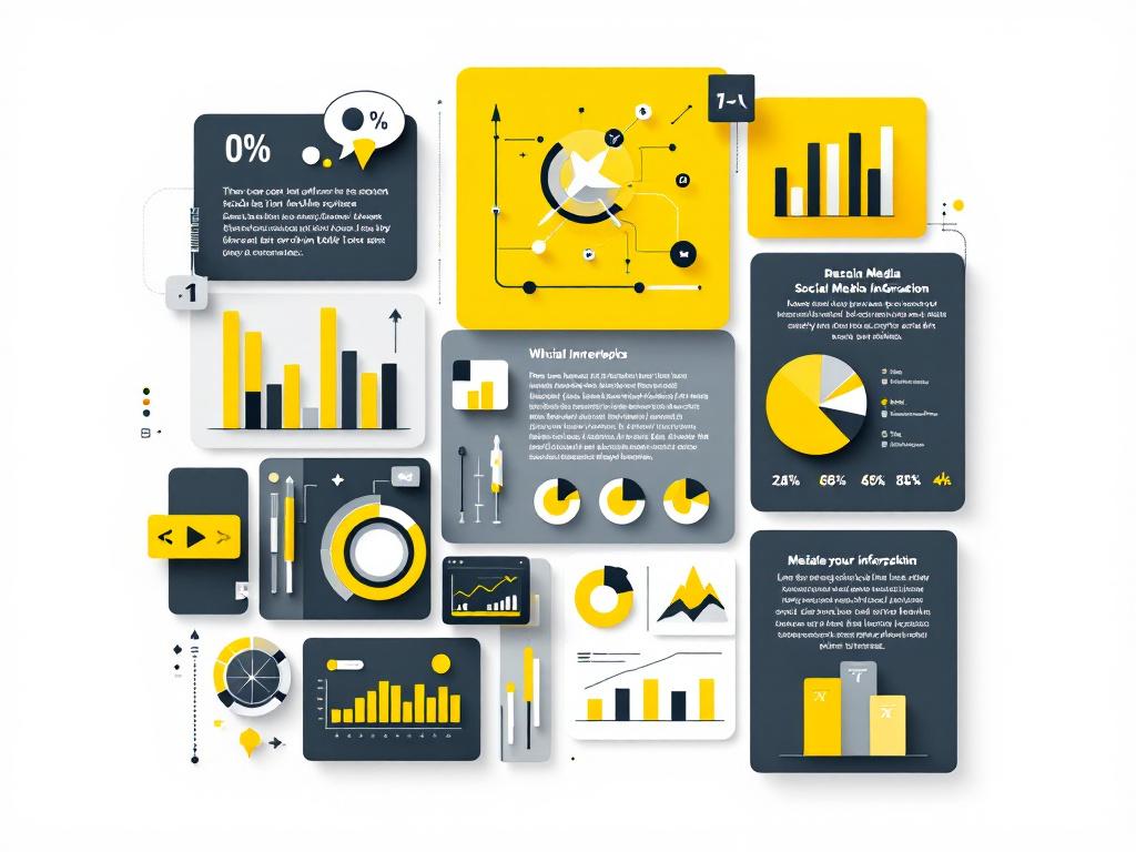
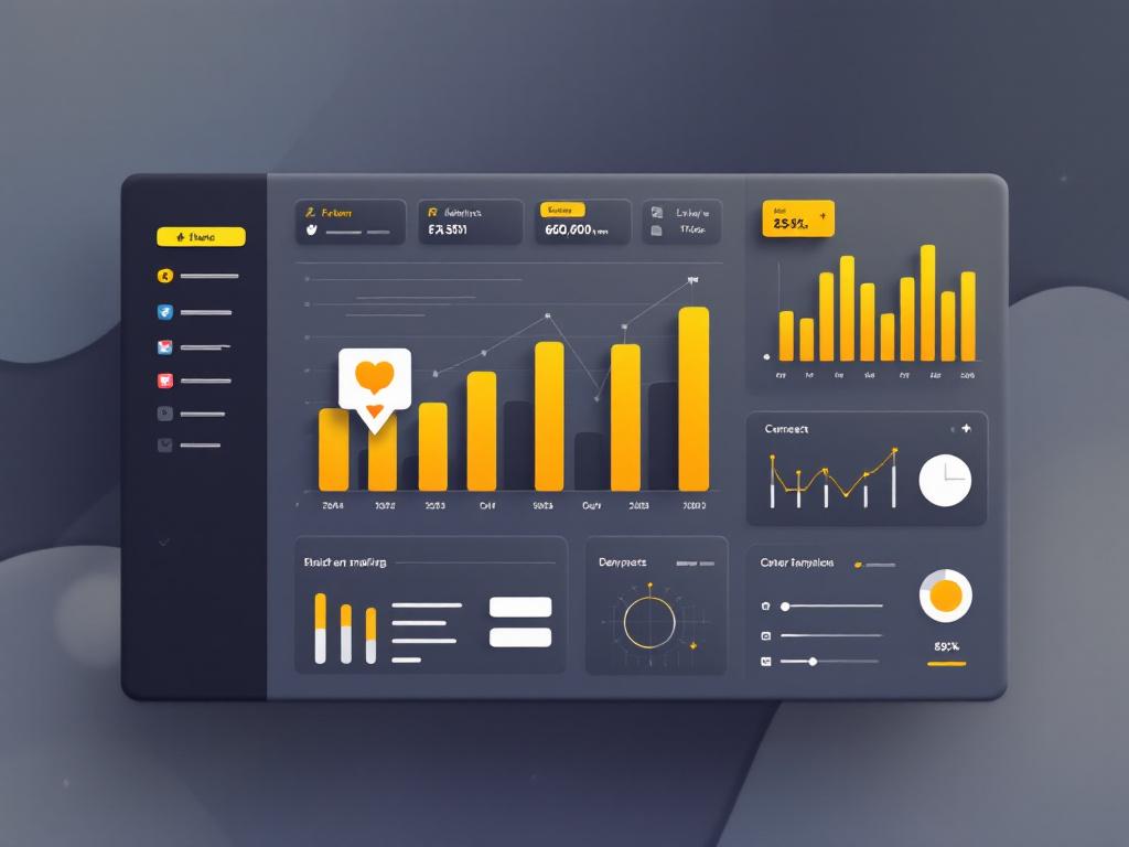
- They simplify complexity. Visual hierarchy turns multiple data points into a single story.
- They’re save-worthy. A strong summary earns the “save” or “share” action.
- They’re evergreen. A good infographic can be republished across channels and campaigns.
- They perform in carousels. Multi-slide infographics consistently outperform single images on most platforms.
Infographic design principles that drive engagement
Great infographics don’t start in Photoshop — they start with a clear idea. If the idea isn’t tight, the design won’t save it. Use these principles to create graphics that people understand in seconds.
1) One idea per graphic
The most common mistake is cramming in too much. If the infographic can be summarised in one sentence, it’s probably focused enough. If it needs a paragraph, split it into a carousel.
2) Visual hierarchy first
Give the viewer a clear path: headline → key point → supporting data. Use size, spacing, and contrast to guide the eye. Most people won’t read everything — design for skimmers.
3) Reduce the data, not the impact
Pick 3–5 data points that support one central claim. More data doesn’t mean more credibility on social media — it usually means lower clarity. If a stat doesn’t strengthen the message, it doesn’t belong.
4) Typography must be readable on mobile
Most engagement happens on a phone. If the body text looks small in a thumbnail, it is. Use generous font sizes, short lines, and enough white space to keep it clean.
5) Consistent branding (without overpowering the content)
Brand colours, logo placement, and typography should feel consistent, but the content should lead. Too much branding reduces shareability. Think of branding as a subtle watermark that’s still recognisable.

Best tools for creating infographics quickly
You don’t need a full design team to create high-performing infographics. Here are practical tools at different skill levels:
- Canva: Fast templates, brand kits, and export presets. Ideal for teams that need speed.
- Figma: Perfect for custom layouts and design systems. Best for consistent brand design.
- Adobe Express: Lightweight option with solid templates and easy resizing.
- Venngage: Built specifically for infographics, especially data-driven layouts.
If you’re investing in a larger social strategy, combine infographics with a broader social media marketing plan so the visuals are part of a consistent growth system, not just one-off posts.
Recommended sizes by platform
Great design can underperform if the sizing is wrong. Here are recommended sizes that keep text readable and layout intact:
- Instagram feed: 1080 × 1080 (square) or 1080 × 1350 (portrait)
- Instagram Stories: 1080 × 1920
- LinkedIn: 1200 × 627 (landscape) or 1080 × 1080 (square)
- Facebook: 1200 × 630 (landscape)
- X (Twitter): 1600 × 900 (landscape) or 1200 × 675
- Pinterest: 1000 × 1500 (portrait)
If you’re building a repeatable content engine, a broader content marketing strategy helps you plan topics, formats, and distribution so each infographic supports a bigger campaign.

Colour psychology and branding for infographics
Colour controls attention. Use high contrast between background and text, and pick one accent colour to highlight the core message. Consistent colour palettes also make your content recognisable in a crowded feed.
- Use 2–3 core colours. Too many colours dilute focus.
- Keep backgrounds neutral. Let data and headings stand out.
- Use colour for meaning. Don’t change colours randomly; map colours to categories or stages.
High-performing infographic layouts
Different messages call for different layouts. Here are structures that consistently perform well:
- Checklist: Perfect for how‑to content or auditing a process.
- Comparison: Great for product or strategy differences.
- Process flow: Ideal for frameworks and step‑by‑step guides.
- Stats board: Best when you have 3–5 strong data points.
- Timeline: Useful for trends or campaign progress stories.
Distribution strategies that maximise engagement
The design is only half the work. How you distribute matters just as much:
- Turn one infographic into a carousel. Break a long infographic into 3–6 slides for higher completion rates.
- Pair with a strong caption. Explain why the graphic matters and invite discussion.
- Republish with context. Share the same graphic in different posts with new angles.
- Add it to your content calendar. Consistency beats one‑off virality. See how to build one in this social media calendar guide.
- Follow platform best practices. The basics still matter — review the fundamentals in this social media best practices article.
Infographic design checklist (quick reference)
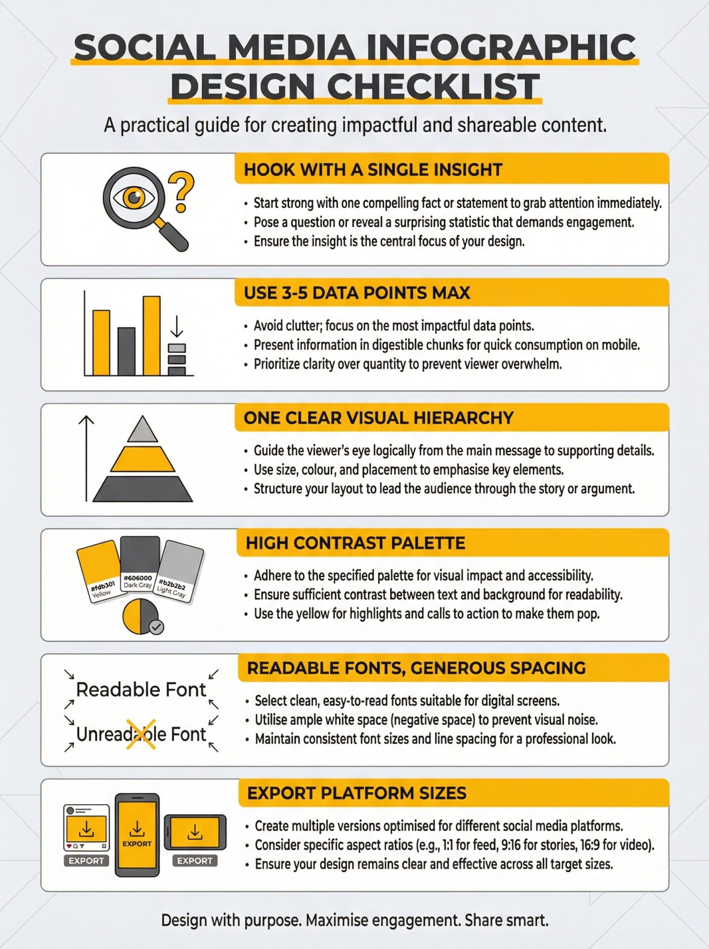
- One clear idea and headline
- 3–5 supporting data points
- Strong visual hierarchy
- High contrast, mobile‑readable text
- Consistent brand palette
- Export sizes tailored to each platform
Final thoughts
Infographics are powerful because they respect the audience’s time. They deliver clarity quickly and give people something useful to save or share. When you combine a solid design process with a smart distribution plan, you get consistent engagement that compounds.
If you want a consistent stream of infographics that align with broader campaign goals, consider working with a team that can tie design, content, and distribution together end‑to‑end.